Today I propose to discuss CTA (Call to Action) - this is one of the most powerful tools on which the success of your communication with by user. When used correctly, it can bring additional conversion to your target page. If wrong, on the contrary, push users away from your site. Correct CTA is the most important component of any advertising company.
What is it?

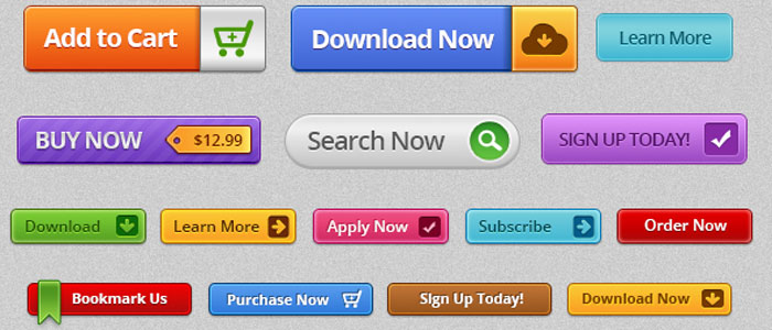
CTA - is created for the sole purpose, namely to force the user perform the action you need that will ultimately benefit you. Converting a user to a client, most often due to button, banner or subscription form. Such calls are placed on landing pages, pop-ups, advertisements, at the end article or post. Simply put, anywhere maximum concentration user attention.
Each the button should be in place and be as clear as possible to the user, so that he has no doubt that he offer. And so we can distinguish for ourselves the first of the three main points successful CTA.
Placement:

better just make a few calls to action on one page. Yes this causes heated debate among online marketers, but we stand on the position that the more CTA on the page, the more likely that some of them will interest the visitor more than others, but here you need immediately make a reservation that CTAs should not compete with each other friend, so as not to confuse the visitor.
play with dimensions in order to distinguish them in the place of maximum concentration of attention. There are studies that show that visitors are most often viewing a page in the form of a letter F or E looking from the upper left corner and moving down, use this.
Text:

Work with text is the highlight when compiling a CTA. Words on the button must have magic that has a direct effect on your target audience.
Before
just clarify, there should be no surprises, because if
the client will be deceived in their expectations from the action he performs, this
adversely affect trust in your site, brand and e-mail newsletters.
Use active verbs inducing action. Be a little marketer a psychologist and a connoisseur of his target audience. But there is universal methods reinforce your appeal with the words: now or for free.
not of little importance is the value of the action performed by the user. If a the client will have no questions, it will be easier for him to do what you need a choice. For example, instead of the “order” button, write “order now and get a 10% discount ”, instead of“ subscribe ”describe the benefits of “Subscribe and receive a book as a gift” subscription. etc.
Design:

C on the one hand, functionality is important, but even the most correctly executed an appeal cannot exist without a beautiful cover. CTA should be recognizable and be sustained in the style of the resource. Gold is important here the middle, so that the call is noticeable and at the same time does not repel their obsession.
Pick up the color of the button, there isn’t any universal solution. It all depends on products and services, site pages, goals, etc. Analyze and try. Perhaps the most important point here is to listen to the designer. None better he won’t tell you what colors and font are needed for the button or banner, even if you are sure of the opposite.
Conclusion:

Efficiency Your site, in many respects depends on the success of your CTA. If you did everything right and good, chaotic client site movements will be settled according to your scheme. But to get what you want result, you need to constantly work on modernizing and analyzing your calls, the only way you can take the conversion of the site to a new level.
You can also check out our offer for the franchise.
